A Coder's Sprint: Behind The Scenes of the Twin Cities Marathon Graphics
originally shared here on
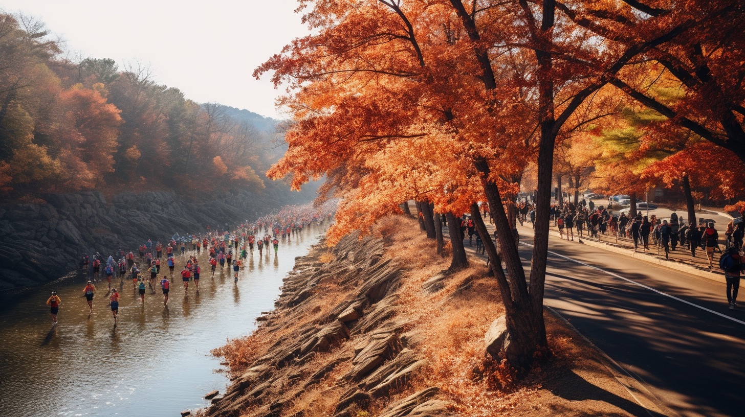
(Editor's note: That graphic is Midjourney's interpretation of what the Twin Cities Marathon looks like. Can you imagine if the Twin Cities Marathon actually looked like that? Running on top of the Mississippi River lmao)
Growing up, I took every chance I could get to be around live TV production.
The thing that keeps drawing me back to the medium is that you basically get one chance to tell a story to which there is an uncertain conclusion. The pressure to get it right is exhilarating.
Even though I haven't been part of a live production in roughly a decade, I had a unique opportunity this past weekend to be part of the live coverage of the Medtronic Twin Cities Marathon.
My role was to be the liaison between the marathon and the production crew who was filming, directing, and producing the show that was to ultimately be broadcast on KARE 11 (the local NBC station). I was to watch the race unfold and keep the crew informed of any interesting moves that we should mention on air.
I also was the liaison between the production crew and the timing crew. I would take periodic data dumps from the timing team, run them through a script I wrote, and pump out some graphics to help keep the audience up to date with the current leaders.
As you may or may not know, the race itself was unfortunately cancelled, so our collective efforts were not able to be showcased.
But even though we didn't get to try out our system live, I wanted to share some of the behind the scenes process for how I was able to get all this stuff to speak to each other. I'm mostly writing this for myself for the coming year, as I'd like to keep improving this process so the 2024 version of the race is chock full of awesome graphics that help to tell the story of the race.
The final product
Every good post should show the results first, right? Well, here's the two graphics I was able to get built in about 72 hours:
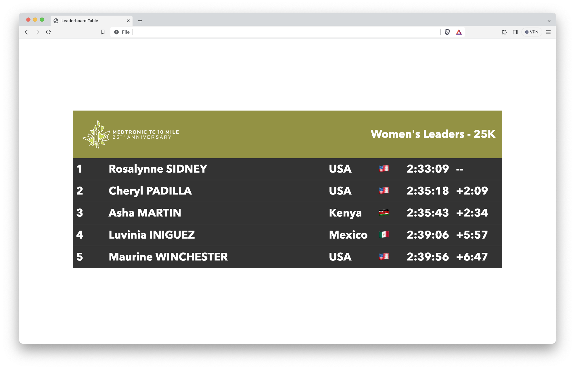
This is a leaderboard intended to be a full-screen graphic, likely to be used with a blurred static shot under it.
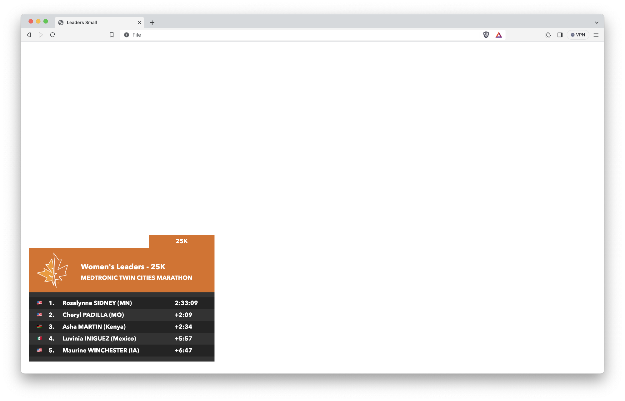
This is a leaderboard intended to be used while on top of a single shot with the leader in full frame.
The timing data
I was fortunate to spend the beginning part of my career working with the crew at Mtec Results. They are the team that helps time many of the major races around the country, most notably the Twin Cities Marathon and Grandma's Marathon, but they also are often called on to help out with other high-profile races like the marathons in Boston and New York City.
It took about 3 minutes of explaining the idea of using "real time data"[^tcm-2023-recap-1] to the team before it was met with a resounding "how can we help?"
We went back and forth around file formats and specs, and after we worked our way through uninteresting technical challenges[^tcm-2023-recap-2], we ultimately settled on a CSV format that looked something like this:
BIB,FIRST NAME,LAST NAME,GENDER,AGE,CITY,STATE,NATIONALITY,TEAM,TEAMTYPE,TIME OF DAY FINISH,GUN TIME,NET TIME,5K,10K,15K,20K,HALF,25K,30K,35K,40K,FIRST_HALF,SECOND_HALF,5 MILE
103,Rosalynne,Sidney,F,31,Burnsville,MN,USA,,,10:33:07.73,2:33:09,2:33:09,18:10,36:24,54:43,1:12:48,1:16:51,1:30:56,1:48:57,2:07:38,2:25:40,1:16:51,,
We decided given our time constraints, we would just keep that CSV in a shared Dropbox folder, and that file would get periodically updated throughout the race.
The graphics
The production team at Freestyle Productions uses an open source tool called SPX Graphics to generate and play back graphics during broadcasts.
SPX Graphics is a fascinating tool that uses HTML, JS, and CSS along with layers to help display all sorts of useful graphics like bugs, lower thirds, and crawls.
It took a little troubleshooting to understand the template structure that SPX uses, but in conjunction with ChatGPT, I was able to build out some basic HTML to create a table that I could dynamically populate:[^tcm-2023-recap-3]
<body>
  <div id="viewport">
    <div id="spxTable">
      <header>
        <div class="logo" id="marathon-logo">
          <img src="./TCM/tcm-logo.png">
        </div>
        <div class="logo" id="ten-mile-logo" style="display: none;">
          <img src="./TCM/ten-mile-logo.png">
        </div>
        <div id="title-container">
          MEN-FINISH
        </div>
      </header>

      <section class="table-body">
        <div class="table-row">
          <div>1</div>
          <div>Rosalynne SIDNEY</div>
          <div>USA</div>
          <div>🇺🇸</div>
          <div>2:33:09</div>
          <div>--</div>
        </div>
        <!-- Add more table-row divs as needed -->
      </section>
    </div>
  </div>
</body>
Hooray, we now have a basic table for a full screen leaderboard! If you throw a little fancy CSS on top of it, you have a really nice looking table.
...but how do we populate it?
Translating the timing data
The CSV that I showed above contains some great data, but it's not particularly useful at the moment.
For starters, if I want to show the current leaders at 25K, do I use the values in the 25K row or do I use the values in the gun time row?
If I want to show how far back each racer is from each other (the time differential between each person), how do I generate that?
What happens if the racer's last name got entered in ALL CAPS instead of Title Case?
I figured I needed to write a tool that helped me transform this data into something a little easier to manipulate from the leaderboard template... so I did!
Behold, csvToJson.html in all its glory!
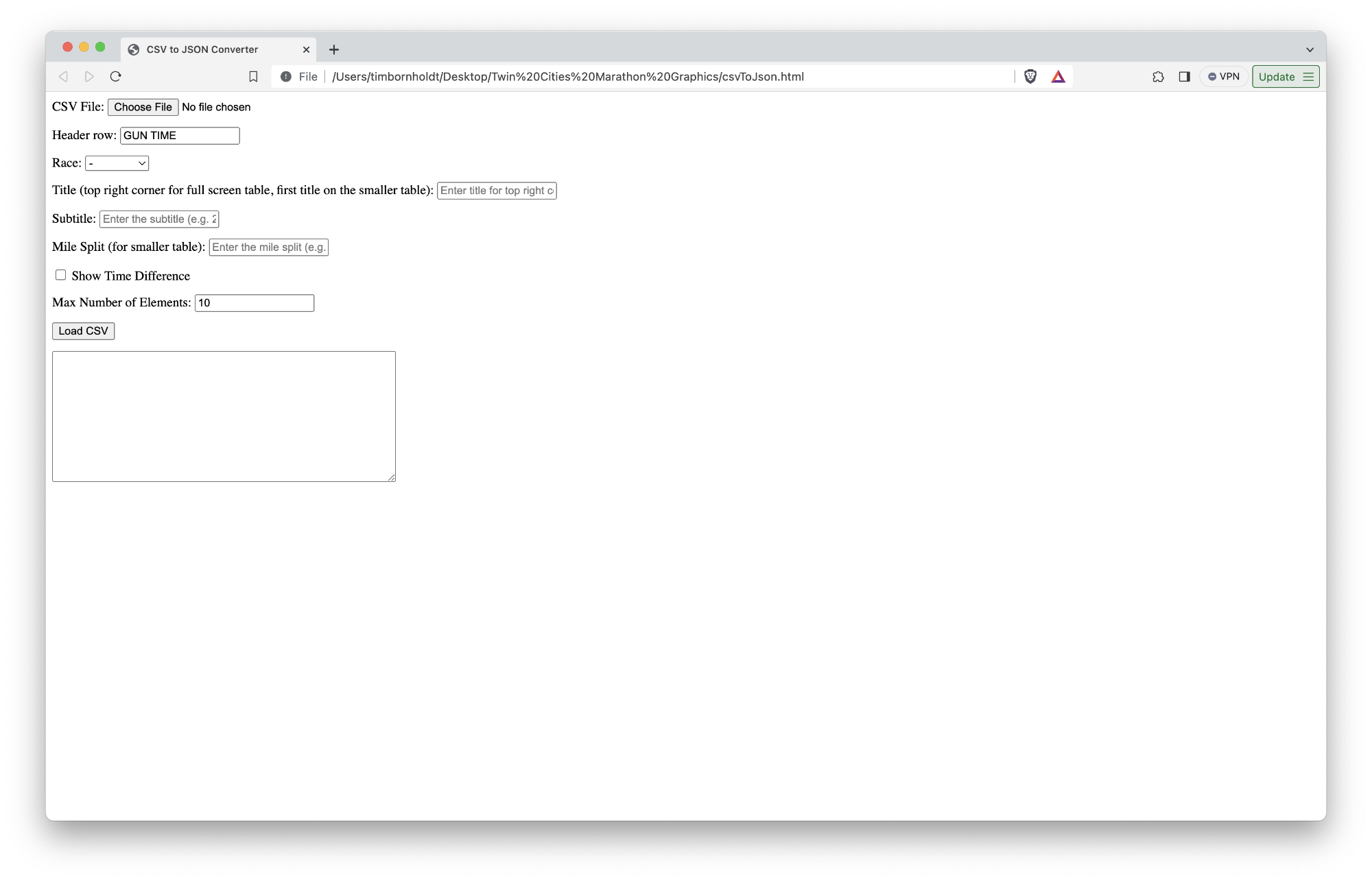
Because I know I'm going to forget what all these fields are for come next year, here's an explanation of what each field does:
- CSV File: This is a basic input field to grab the CSV file from a local disk.
- Header row: This is the name of the header row for which I want to pull the timing value (e.g. GUN TIME, which would pull 2:33:09 from the CSV example above)
- Race: This allows me to tell the front end template which race to style it as
- Title: This is the title in the top right corner for the full screen version or the first title on the smaller version
- Subtitle: This is the second title on the smaller version (basically the name of the race)
- Mile Split: In the smaller graphic, there's a little notch in the top right corner that contains the mile split for the most recently passed timing mat. This field lets me fill that in with the split.
- Show time difference: On the full screen graphic, we may (or may not) want to show the time difference (e.g. +2:09).
- Max number of elements: This should've probably said "max number of rows" because that's what this field controls. The full screen version of this graphic looks best with 10 entries, whereas the smaller version of the graphic looks best with 5.
Once you click "Load CSV", I fire off a Javascript method which loads the CSV and converts each row into a JSON object that looks something like this:
{
  "race": "marathon",
  "title": "Women's Leaders - 25K",
  "subtitle": "MEDTRONIC TWIN CITIES MARATHON",
  "mile_split": "25K",
  "show_time_difference": true,
  "table_data": [
    {
      "position": "1",
      "name": "Rosalynne SIDNEY",
      "time": "2:33:09",
      "difference": "--",
      "state": "MN",
      "country_name": "USA",
      "country_flag": "🇺🇸"
    },
    // More entries here
  ]
}
I would then take that JSON and paste it into a file stored on a remote server.
Now that I have both a beautiful-looking template and a beautiful-looking source of data, I was able to whip up some Javascript on the template side to read that file on page load and populate the table with all the customizations included on it.
What's next?
It was truly a bummer that the race didn't get started. As someone who has gotten heat stroke at mile 21 of a marathon, I know that the organizers of the race did the right thing by cancelling it outright.
As someone who was in charge of building and displaying these graphics, though, I am a bit relieved that I get another year to iterate on this foundation.
Here are the obvious areas for improvement:
Automate the fetching of the data from Dropbox
If it wasn't clear, this process was brittle and prone to human error. I was having to load Dropbox from the web, download a CSV, manually sort it in Numbers based on the gun time, remove all but the top 10 or so rows of data, and then save a sanitized version.
There could be a tool written to automate this process so it is continually polling for updates to the file, and once it finds updates, it automatically does the sorting and converting so I don't need to touch it.
Automate the creation of the JSON from that timing data
Similar to above, I shouldn't need a csvToJson.html file. Because I'm sharing the data between the two templates, I should hard code the number of rows I want each template to read, and then I can fully automate the creation of the JSON it uses to populate the table.
Also, because of how SPX works, I need to host that JSON file somewhere remotely that the graphics system can access whenever the director calls for the graphic. That process should be similarly automated.
Improve the flag display
The Twin Cities Marathon attracts professional marathoners from all over the world, but it's not uncommon to see Minnesotans and other Americans finish in the top 10. It might be cool to use state-level flags instead of the US flag for the top athletes.
Another little annoying thing: I only had five countries hard-coded in my JSON creator because that was what I had from the representative data sample (USA, Canada, Mexico, Kenya, and New Zealand). I should probably support more flags because you should always be prepared for an unexpected performance from someone not from one of those five countries, right?
MOAR GFX PLZ KTHX
This leaderboard only scratchs the surface with what's possible.
With the timing data we're getting, I should be able to have a permanent graphic built that shows the top 10 runners at all times.
I should also have more graphics that you see in most professional marathon broadcasts:
- An omni-present clock[^tcm-2023-recap-4]
- Biographic slides that show a runner's photo along with some of their professional highlights
- Slides with historical facts (course record holders and whatnot)
- A map showing where runners are along the course
But I want more!
If we start planning now, we could attach biometric gear to some of the runners and show things like current heart rate, current pace, current stride count, and more.
Even if we aren't able to pull that off, we could still use the existing data to tell interesting stories like how the hill on Summit Avenue affects pace and how many runners are actually hitting "the wall".
Gearing up for 2024
I am so pleased with what we were able to pull together in basically a week.
Now that we have a better understanding of the technology that powers the graphic system, I am beyond excited at the possibilities ahead of us next year.
The team at Twin Cities in Motion truly care about putting on a best-in-class event for runners. Their commitment and investment in this broadcast are evidence of this, and I am honored to be part of the team responsible for telling the story of the two races that take place that day.
Mark your calendars for next October. It's gonna be an exciting race to watch live!
[^tcm-2023-recap-1]: For our purposes, we basically mean up to date within a minute or two of capturing the data. Getting updates to the leaderboard within milliseconds of a racer crossing a timing mat is not yet technically feasible. Besides, time is an arbitrary construct, right, maaan? [^tcm-2023-recap-2]: The software used to capture timing/scoring data for races is necessarily archaic. I say "necessarily" because it's both a feature and a bug; you don't want to put your trust in some fancy pants, brand new, untested Javascript framework to calculate results for an event that depends on those results for attracting big name runners, sponsors, and money. Of course, you can wrap all sorts of transforming layers on top of the data you collect from the timing systems, which is what Mtec does to power their results pages. But creating an API on top of that layer was not really feasible in the time we had. [^tcm-2023-recap-3]: You might notice in that HTML that I have two logos: one for the marathon and one for the ten mile. This allows me to reuse the same leaderboard graphic but style it orange or green to fit the relevant race. Also, stop judging my HTML! [^tcm-2023-recap-4]: Do you know how hard it is to get an accurate clock to display on screen? The homies that create professional football graphics are insanely talented. Again, time is an arbitrary construct.