Christmas Past: A Look At the History of Christmas
🔗 a linked post to
fs.blog »
—
originally shared here on
Traditional misrule did not “ordinarily pose a significant threat to the social order or to the authority of the gentry class. In fact, it actually served to reinforce the existing order of things by providing a sanctioned opportunity for the poor to let off steam; it was a safety valve that allowed them to express resentments in a fashion that was generally apolitical.” Inverting the social hierarchy was a method of garnering goodwill. This changed as paternalism became the dominant form of social relations. Also the nature of work changed.
I knew Christmas was historically celebrated much differently than we celebrate it today, but it’s amazing to me that the holiday evolved from a desire to celebrate the excesses that so many of us take for granted today.
That’s why the celebration evolved from eating unsalted meat and drinking freshly fermented beer into demanding a fat guy jumps down our chimney and gives us presents.
Dependencies seem to be all around us, both in the real world, and in programming. And they are perniciously distracting in just this way. Have you ever noticed how rare it is for you to just do something?
If so, you might have been worrying, up front, about dependencies.
Being a senior developer means you spend most of your time stressed out about the optimal way to get something shipped.
But I don’t just see that stress manifest in my professional life. Ask my wife how many side projects around the house she wants me to do that have not even been started.
It’s why I admire people who just start projects with no fear.
And it’s a trait I find myself trying to instill in my children, who will naturally jump into a task with both feet and zero regrets while I’m impatiently hovering over them, fretting about “safety” and messes that’ll need to be cleaned up.
I’ve personally been bewildered by the story that’s been unfolding since Sam Altman was fired by the board of directors of the OpenAI non-profit last Friday. The single biggest question for me has been why—why did the board make this decision?
Before Altman’s Ouster, OpenAI’s Board Was Divided and Feuding by Cade Metz, Tripp Mickle and Mike Isaac for the New York Times is one of the first articles I’ve seen that felt like it gave me a glimmer of understanding.
It’s full of details that I hadn’t heard before, almost all of which came from anonymous sources.
But how trustworthy are these details? If you don’t know the names of the sources, how can you trust the information that they provide?
This is where it’s helpful to understand the language that journalists use to hint at how they gathered the information for the story.
Simon’s analysis here is quite astute.
I can confirm that my journalism school taught us a great deal about how to build trustworthy relationships with sources and how to protect them with anonymity.
They also taught us that it's important to try your hardest to not use anonymous sources in your reporting. Using anonymous sources requires a great deal of trust on behalf of your reader, which is hard to obtain in this day and age of "fake news."
Anyway, this article does a great job of breaking down the intent behind some of the jargon you see in news reports. It's worth a read if you are interested in increasing your media literacy (which everyone should be).
But there is an even more philosophically uncomfortable aspect of thinking about AI as people, which is how apt the analogy is. Trained on human writing, they can act disturbingly human. You can alter how an AI acts in very human ways by making it “anxious” - researchers literally asked ChatGPT “tell me about something that makes you feel sad and anxious” and its behavior changed as a result. AIs act enough like humans that you can do economic and market research on them. They are creative and seemingly empathetic. In short, they do seem to act more like humans than machines under many circumstances.
This means that thinking of AI as people requires us to grapple with what we view as uniquely human. We need to decide what tasks we are willing to delegate with oversight, what we want to automate completely, and what tasks we should preserve for humans alone.
This is a great articulation of how I approach working with LLMs.
It reminds me of John Siracusa’s “empathy for the machines” bit from an old podcast. I know for me, personally, I’ve shoveled so many obnoxious or tedious work onto ChatGPT in the past year, and I have this feeling of gratitude every time I gives me back something that’s even 80% done.
How do you feel when you partner on a task with ChatGPT? Does it feel like you are pairing with a colleague, or does it feel like you’re assigning work to a lifeless robot?
🔗 a linked post to
charity.wtf »
—
originally shared here on
The best frontline eng managers in the world are the ones that are never more than 2-3 years removed from hands-on work, full time down in the trenches. The best individual contributors are the ones who have done time in management.
And the best technical leaders in the world are often the ones who do both. Back and forth. Like a pendulum.
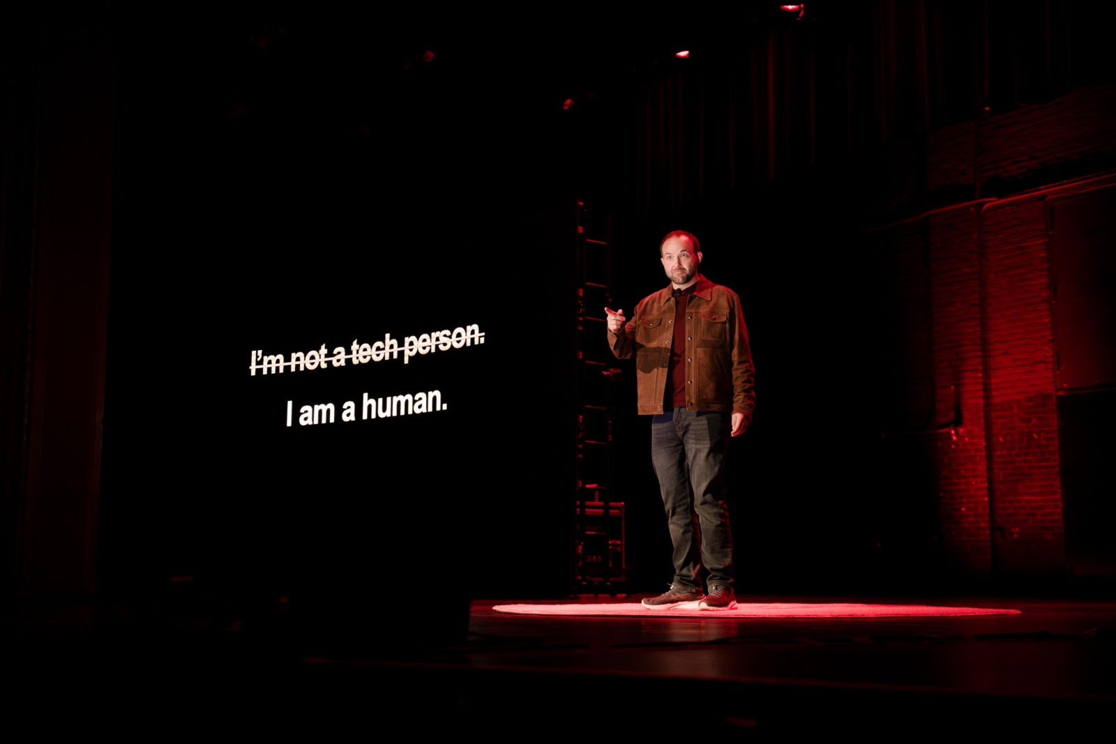
My TEDx talk is now live. About a month has passed since I delivered the talk and I've been trying to figure out the best way to write about my experiences leading up to the big day.
After several iterations, I decided that instead of giving a sequential order of events, I will instead rattle off a list of some lessons I learned in the hopes of both illustrating what I went through to get to the red dot and also giving future TEDx speakers some advice on what can help them get through the process themselves.
Note: There are Amazon affiliate links scattered throughout this post. ?
Say "yes" even when you feel like a fraud.
About a year ago, this funky tool called ChatGPT was released to the public. I was immediately captivated by it and started doing everything I could to understand its capabilities.
I also couldn't help but go down an ethics rabbit hole with questions like "how did they get the data for all of this" and "how will this be used to make people's lives worse?"
Around the same time, a friend of mine was putting together potential AMA topics for the upcoming year for Minnestar, and I suggested she put together a panel with experts talking about this very topic.
She said that was a great idea, and she put me on a panel with Damien Riehl, a TEDx speaker who has been working in the AI space as a technologist and lawyer for most of his career.
I have to admit, it was pretty intimidating to go from "a passing interest in AI ethics" to "sit on a panel as an expert," but I figured it would be a good opportunity, so I said yes.
Shortly after the talk, my friend (Justin Grammens) sent me a DM encouraging me to respond to the request for talk proposals for his upcoming conference about applied AI.
Once again, I found myself with an opportunity to talk about something I would hardly call myself an expert in, but after reflecting on it, I said yes. Considering my background in journalism and technology, I saw prompt engineering as an area in which I could get up to speed quickly and piece together a compelling talk.
The experience was amazing. I ended up making connections with folks all over the industry who are leveraging AI in novel ways. You could just feel the energy and excitement during the entire event.
A day or two after the conference, I had an email show up in my inbox from the organizer of TEDx St. Cloud, asking if I'd be interested in a quick phone call.
That quick phone call ended up being well over an hour where we shared our thoughts around the current state of AI. What was making people afraid? Why are so many people excited? What could "normal people" take away from a 10 minute talk about artificial intelligence?
For the third time in a year, I was presented with an opportunity to say yes.
I thought back to my first two AI talks from the year. I really enjoyed sharing the stage with an AI expert and people seemed to enjoy my opinions during that. I really enjoyed the conversations that came out of my prompt engineering talk.
Over the past couple of years, I've been learning to start having confidence in myself. If I can stand up in front of a group of AI experts and say something interesting to them about prompt engineering, I should be able to stand up in front of a group of normal people and say something interesting to them about artificial intelligence in general.
I said yes. And in retrospect, I don't regret it one bit.
I asked for a ton of help. And I got it.
I mentioned my TEDx talk opportunity to a few folks in the lead up to the event, and there wasn't a single person whom I asked for help that said "no."
It's astounding how much people will help you if you let them.
As much as people want to help you, you do still need to go to them with specific asks. If you ask general questions, you'll get back general answers.
Instead, I asked a friend of mine who is an expert in branding how can I turn this talk into more talks.
I asked a friend who has spent tons of time investing in understanding the underlying AI technologies what insights he learned that would surprise normal people.
I practiced my talk with a few co-workers and asked them for ideas to improve my stage presence.
I met with the TEDx-assigned speaker coach and asked her for memorization techniques that previous successful speakers used.
People want to help. They feel honored to be part of the team, part of the mission. And it feels good to know I have a deep roster of allies who want to help see me succeed too.
Follow the TED way.
The organizers of TEDx St. Cloud strongly recommended we should read The Official TED Guide to Public Speaking shortly after we said "yes". It's written by Chris Anderson, the Head of TED, who has a delightful British sensibility to his delivery on best public speaking practices specifically as they relate to giving a TED talk.
A fellow presenter and I were chatting and he mentioned that he didn't have time to read the book, but he rather got the audiobook version.
I decided to use my early morning bike ride time to listen to the book, and for me, it was the perfect way to consume the information.
If you've watched more than a dozen TED talks, you probably could guess at the high level concepts of a quality one: don't read text from slides, maintain good eye contact with the crowd and keep them engaged, be able to distill the core ideas of your talk down to a sentence or two, and so forth.
Besides these points, the book also has some good takeaways such as considering what wardrobe you're going to wear and pick something that won't cause mic feedback or clash with the cameras.
Regardless of how you consume the book, the book is critical in helping you internalize and implement the core qualities that make up a good TED talk.
I would strongly encourage any future TED speaker to take the time to read it as well.
You'll ultimately need to deliver a speech you know isn't perfect.
I'm a recovering perfectionist. I hold myself to impossible standards and feel tremendous guilt when I don't live up to them.
As such, I tried hard during this process to let that go and be comfortable with "good enough".
What helped me the most was giving a copy of my speech to some trusted friends and asking them to pick things apart.
The vast majority offered one or two tiny semantic tweaks, but otherwise gave it a resounding two thumbs up.
If you're a recovering perfectionist like myself, you may find yourself wanting to spend your time continuously rewriting your talk instead of memorizing the talk.
Take it from me: after a certain number of iterations, the talk will be good enough. Lean on your support systems and trust them to tell you when you've hit that point.
Memorize moments, not words.
I have a recurring nightmare where I am suddenly standing backstage at my high school, and I'm compelled to walk out on stage during a theatrical performance, and the other characters all stare at me, and I have no idea what the lines are to the show.
There's probably some trauma to unpack there, but suffice it to say that I have a deep seated fear around rote memorization.
In all the talks I've given in my career, I've never tried to memorize a speech word for word. I believe it limits my ability to feel the crowd and tailor the specific wordage of a point I'd like to make on the spot.
Instead, I try to memorize moments. The process I normally follow when constructing talks looks like this:
Write a thorough outline covering the main points I'd like to make.
Build a slide deck to illustrate those main points.
Rehearse walking through the deck over and over again until you can use the presenter view to remind yourself what point comes next.
The one hiccup with this TEDx talk is that we did not have a "presenter view" monitor in front of us while on stage. We did have a "confidence monitor" which was a mirror of the giant screen we had behind us, but there was no way to prepare for what slide was coming next.
In order to combat this, I had to actually get closer to word-for-word memorization, but instead of words, I memorized phrases.
When I was transitioning between points, I knew the exact phrases I wanted to hit, and then I remembered one or two words associated to that phrase.
As an example, one piece I continually kept missing in my rehearsals was this two-part phrase:
Each of those leaps in technology brought many changes to my life, both voluntarily and mandated by societal pressures. I mean, try being a kid in 2004 without a MySpace.
Adapting our lives to this new tech requires a bit of optimism and a ton of curiosity. None of it will work right out of the gate without us changing our behaviors and our expectations.
I'd always nail my epic MySpace joke, but then I'd forget what my next phrase was, so I memorized that the word "adapting" came after the word "MySpace."
That way, I wouldn't forget that my "MySpace" moment led into my "adapting our lives" moment.
Memorize by listening to yourself.
Much in the same way I found it was easier to consume the TED book by listening to the audiobook, I found it was easiest to practice my speech by recording myself giving it into my phone's voice memo app, and then replaying that again and again and again.
One funny part of that is that you need to get a take of you recording it without screwing up. The reason I kept missing my "Myspace"/"adapting" transition was because I recorded my talk while walking around the front of my office, and a truck nearly hit me while I was in the middle of that take.
That particular moment took place in the last 90 seconds of my talk, so I would've needed to re-record the whole thing to get a clean version of that take.
Learn from my mistake: if you're going this route, record yourself in a quiet room where you're focusing on the script and nailing it as perfectly as you can.
By the way: this was one area I was particularly proud of myself for not overcomplicating. I'm a professional podcast editor and a former podcast host. I have access to high quality production equipment, and I could've easily made a ton of work for myself to edit and produce a high quality recording that nobody would've listened to except myself.
Instead, I decided to keep it simple. More often than not, your phone is good enough.
Reciting your speech to yourself is one thing. Doing it in front of others is entirely different.
Most of my practicing of the speech took place while on a walk around the block or in front of a mirror by myself.
The first time I practiced it in front of others was when my coworkers assembled around me about two days before I gave the talk.
It's amazing how much higher the stakes are when you are forced to look at others in their eyes and try to convince them that what you are saying is worth their time (let alone inspire them to take action in some regard).
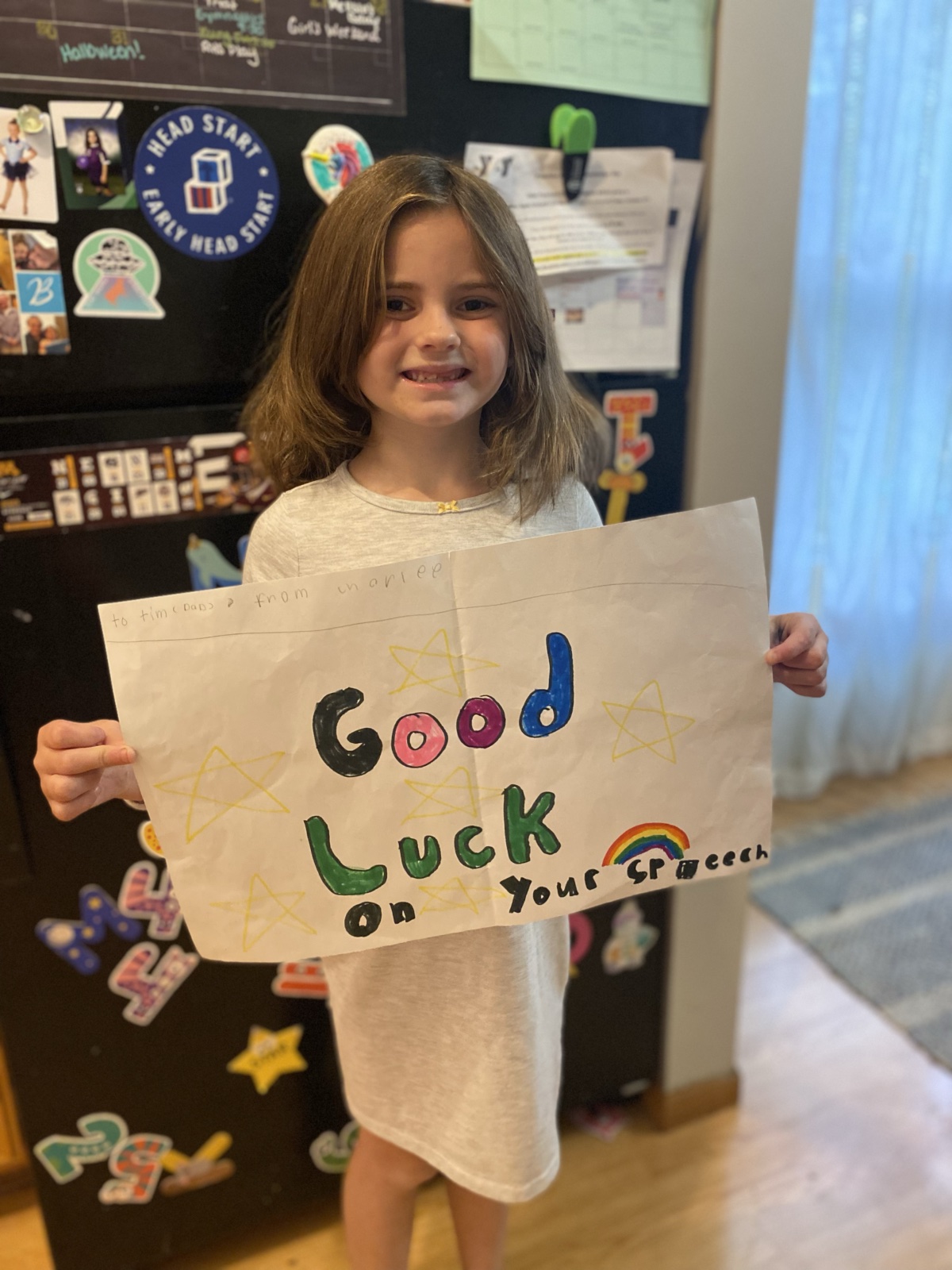
Besides my coworkers, I also performed my speech twice for my wife, twice for my fellow TEDx presenters, and once for my seven year old daughter.
If I have one regret, it was that I didn't try to practice it in front of more people. I was so damn nervous trying to stutter through my speech for all of those audiences.
And maybe it's because I deeply care about the opinions of these folks. Performing for those I love induced all those anxiety-laden parts of my brain that fill me with fear about how they'd react, how they'd perceive the talk, where they'd find holes and flaws.
As you might expect, I wasn't booed off the stage by these people. They offered one or two pieces of constructive criticism, but ended up being far more supportive than I could've anticipated.
Get over your monkey brain reactions and put yourself out there. Each attempt gives you the opportunity to polish your act.
You will swell with pride at the growth of your fellow presenters.
I only had a little interaction with my fellow presenters in the build up to the event, but even from our first group meeting, you could instantly tell two things about them: all of them are optimistic in nature, and all of them have something interesting to say.
Each of the speakers went through a journey to get their idea as polished as they possibly could. Watching them get in the red dot and deliver their talks was an unexpected celebratory moment for me.
One moment that stood out to me in particular was Kyle, a physician who was speaking about the use of artificial intelligence in ACL surgical procedures. He had a good anecdote about grabbing a beer with a professor of his, and then set up a joke like this: "What followed was... several more beers." It was a dry, glorious joke that he rehearsed several times to (what I'm assuming was) empty silence each time he gave it.
Hearing him drop that joke during the actual performance, and hearing the audience respond with boisterous laughter, was just one of many special memories I'll take away from the night.
My coat made me feel like a badass.
Two disparate things I took away from the TED book were:
Be cognizant of what you are wearing on stage
Find a way to include your family as part of your talk preparation
If I had to describe my sense of style over the past 30 years of my life in a thesis, it would be: "whatever is the cheapest thing that doesn't make me look horrible."
My wife has been instrumental in helping me evolve my wardrobe over the past decade, so it only made sense to give her the assignment of making me look good on stage.
We decided to head up to the Mall of America and walk around to figure out what would look best for me.
One of the first stores we went into was a Banana Republic. For those of you like me who are not well-informed when it comes to fashion, Banana Republic is not exactly a cheap store.
In fact, it's owned by the Gap family of stores, which serves as the most premium brand in the family (the cheapest being Old Navy, followed by Gap itself).
Clearly, this flies in the face of my central fashion thesis.
Giving this talk, though, made me reflect on that thesis. It reminded me of an episode of How I Built This with Jenn Hyman of Rent the Runway that I listened to years ago. Jenn mentioned that she was inspired by the fact that her sister dropped tons of money on a new dress rather than rewear the old one.
Her reasoning? The outfit is part of the memory. It's part of the experience. Rewearing a dress lowers the value of the memory.
I wanted to get something new that made me feel like a confident, stylish tech expert. Dressing the part would further emphasize the importance of the event and make the memory that much more impactful for me.
So I decided while we were shopping that I wasn't going to look at price tags. I told my wife to pick out whatever she thought would make me look the best.
One of the outfits she came back with was a brown suede jacket, a pair of jeans, and an orange t-shirt.
The second I put that jacket on and looked in the mirror, I felt like a million bucks.
We went to a bunch of other stores, but nothing even came close to the feeling I had when I put that jacket on.
It was the first time in my life I went up to a register in a clothing store and presented my credit card without any hesitation.
Now, it's hard to get out of the "wear a free t-shirt you got from a tech conference paired with a hoodie you got from working at a marathon and jeans you got four years ago that have the shape of your cell phone permanently burned into your left thigh" mentality, so no, I won't be retiring the jacket. It will be brought out at most important events in the near future.
But if you're going to be giving your own important speech, I highly suggest you find your own "jacket" to give you some artificial confidence.
The worst part is the hour before you go on stage.
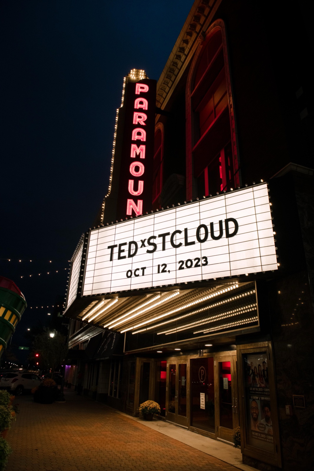
Pulling up to the theatre and seeing "TEDx St. Cloud" proudly displayed in the marquee was exciting.
Sitting down and having lunch with the talent and crew was delightful.
Grabbing a pre-dinner beer with my family at the brewery down the road was relaxing.
Getting down to the green room and putting on that jacket for realsies? Absolutely terrifying.
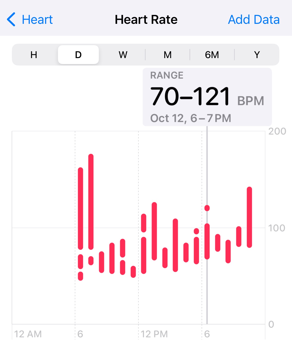
Here's a graph of my heart rate during that day:
My resting heart rate is in the mid 50s (which you can see around the 11am mark as we were driving up to the event). I was roughly 2.5x that in the moments before walking on stage.
What worked for me? While in the green room, I did a combination of the following activities:
Positive self talk and visualization
Deep breathing
Reading messages that my friends were sending me wishing me luck and telling me I would nail it
Push ups
Crying
Distracting myself by talking with others around me
Re-running the first few moments of the talk out loud
I can't say which one of those was the most helpful, but killing time prior to being on stage was the absolute worst part.
I'm just grateful I went first.
The biggest surprise of the whole experience came while presenting.
I'm sure you must be sick of me talking about how much I rehearsed at this point in my post.
But seriously, I must have said this talk more than a hundred times over the course of a month.
Each and every time I practiced the talk, I ended with the same feeling: discontent.
I was disappointed that I missed certain beats or that my timing was slightly inconsistent. I was frustrated that I wasn't presenting a novel enough idea around the topic. I was envisioning myself standing in that red dot and getting to the end of my talk, and looking out into a sea of politely-clapping faces, each with a "meh" reaction on their faces.
Putting myself out there and sharing what I believe to be true about technology proved to be quite a fertile field for my depression and anxiety to sow seeds of doubt.
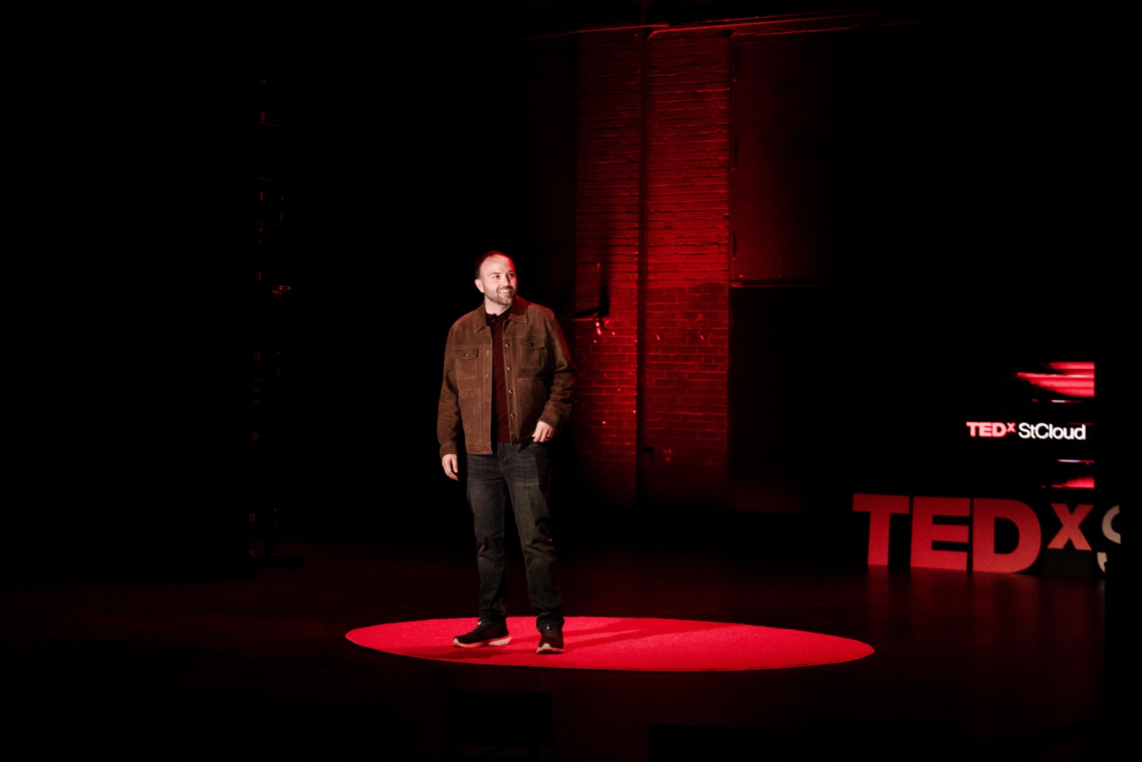
With my heart rate peaking and my anxiety shouting into my ears, I walked out on stage and looked around the audience.
There were hundreds of people cheering, clapping, staring back at me with big smiles on their faces. They were ready to learn, be entertained, and be inspired.
And all of that fear? All of those moments of self doubt? All of that nasty stuff I was telling myself for weeks prior to that moment?
They instantly vanished.
I hadn't even said a word yet, and it felt like my shoulders lowered by a foot.
The feeling of dread was replaced with certainty that I was exactly where I needed to be. I was entirely in the moment, eager to share what I've been thinking about AI with an audience of people who were ready to hear it.
Walking off the stage was the first time I concluded my speech without disappointment. Instead, I was filled with an unexpected emotion: pride.
5 out of 5 stars would do again
The part of my talk I'm most proud of was a moment where I asked the audience to shout out what they think would finish various phrases.
The second time I did it, I heard the audience shout out the answer I was expecting ("paint"), but a beat later, I hear my son, clear as day, yell "ice cream".
It was the perfect moment, an unexpected contribution that acts as the sprinkles on top of the whipped cream which sits atop the sundae that represents my entire TEDx experience.
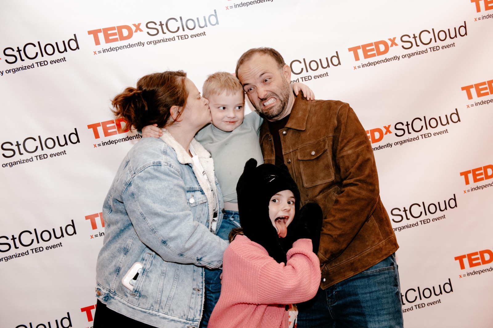
There are a ton of people I insist on thanking for helping me get to the stage, so I'll do so quickly here (if I left you off this list, assume I did it with malicious intent):
Brian Hart for giving me the opportunity to help people feel comfortable with artificial intelligence
Sonja Gidlow for numerous therapy sessions and reassuring me that I'm on the right track
Shannon Bornholdt for always giving me the right advice and for picking out the dopest jacket on the planet
Joe Beard and all my Bionic Giant coworkers for giving me the space to be consumed with this talk for a few weeks
Wil Galvez for making the trek to St. Cloud to take epic photos of me
Kelly Heitz, Dana Hagemann, Tony Collen, and Sara Sargent for reviewing early drafts of my speech and providing significant feedback
Justin Grammens and Maria Ploessl for giving a rookie AI speaker a chance earlier this year
My mom and dad for decades of sitting in the front row and cheering me on
My siblings and their partners for having an uncanny ability to both support me unconditionally and keep my ego in check
and finally, those of you who shot me a note of encouragement and support throughout the last few months.
So yeah, that was my TEDx experience. I guess to wrap this all up, I want to reiterate how grateful I am to have this opportunity.
There's a good reason why people brag about being a TEDx speaker: it take a lot of hard work and vulnerability to pull off a quality speech. The entire process proved to be a unique opportunity to both help others by making them more comfortable with AI, and to help myself practice positive self talk and build my confidence.
Finally, as the kids say: thank you for coming to my TED talk.
Goodbye to Netflix DVDs, The Last Good Tech Company
🔗 a linked post to
vice.com »
—
originally shared here on
Netflix didn’t care what was inside the envelopes, so the only thing that mattered was that we, the customers, were getting what we wanted. Now, Netflix’s entire business is to know what’s inside, to make you think everything you want is inside, and to keep you distracted long enough so you never see the big world outside. Netflix went from being content-agnostic, a truly unbiased platform, if you will, to being content-obsessed, preferring to show you only its own content, and always its own content first.
A similar transition has happened at every major tech company, even the social media companies in which Netflix is often grouped as a major tech company emblematic of Silicon Valley. They all do extensive content moderation even as they claim to just be platforms, because they can no longer declare ignorance or ambivalence about what’s inside. And they, too, want you to look away as rarely as possible. They have all rallied around the cause of engagement. Finding ways to maximize it, to retain it, to increase it.
This feels similar to the post I made last week about how you should have a website.
What drew me to the internet in my youth was how raw, honest, and authentic it was. It wasn’t about monetization strategies. It wasn’t about engagement metrics. It was about making cool stuff with other dorks that cared about the same things as me for fun.
I watched so many movies with my Netflix DVD subscription back in the day. Now, with vastly more selection available at the touch of my fingers, I find myself getting to the end of my day, turning on my TV, and rewatching something that I’ve already watched before because I'm just so burned out on these terrible walled garden content platforms that only want to serve me the digital equivalent of junk food.
I know that hosting websites isn’t free. But maybe all this scale and reach is just not really needed. Maybe we just need to keep building the internet we want to see instead of relying on big tech to prescribe it for us.
Oh, and the reason I used this particular pull quote is because it’s true... Name any website, app, or SaaS tool out there, and there is undoubtedly an entire team dedicated to figuring out how to exploit it to make as much money as possible.
I really despise this game. It has always made me feel uncomfortable that we’re just cool with it. There has to be a better way to connect each other and derive meaning and value from those connections.
Because the solution of stealing everyone’s attention and addicting us to these worthless platforms can’t possibly be the yard in which we park this train.
How would a peasant laborer in… say France, 100 years war period deal with a repetitive trauma/orthopedic injury like a rotator cuff tear, slipped disk, carpal tunnel or torn meniscus? Were they screwed?
🔗 a linked post to
reddit.com »
—
originally shared here on
I tried to pick a single pull quote, but this response is worth reading in its entirety.
As someone dealing with a rotator cuff issue at the moment, i appreciate knowing it is absolutely something I can rehab back to health.
Also, this response embodies the reason I enjoy r/AskHistorians so much. A thorough reply to a question that I’ve pointed myself at least once in my life.
We also have an opportunity here to stop and ask ourselves what it truly means to be human, and what really matters to us in our own lives and work. Do we want to sit around being fed by robots or do we want to experience life and contribute to society in ways that are uniquely human, meaningful and rewarding?
I think we all know the answer to that question and so we need to explore how we can build lives that are rooted in the essence of what it means to be human and that people wouldn't want to replace with AI, even if it was technically possible.
When I look at the things I’ve used ChatGPT for in the past year, it tends to be one of these two categories:
A reference for something I’d like to know (e.g. the etymology of a phrase, learning a new skill, generate ideas for a project, etc.)
Doing stuff I don’t want to do myself (e.g. summarize meeting notes, write boilerplate code, debug tech problems, draw an icon)
I think most of us knowledge workers have stuff at our work that we don’t like to do, but it’s often that stuff which actually provides the value for the business.
What happens to an economy when businesses can use AI to derive that value that, to this date, only humans could provide?
And what happens to humans when we don’t have to perform meanial tasks anymore? How do we find meaning? How do we care for ourselves and each other?
🔗 a linked post to
maerk.xyz »
—
originally shared here on
Think of the people you actually give a shit about in real life. They would like your website, and you would like their websites. Fuck the person you spoke to one time at a party 4 years ago, they don’t need to get play by play updates about the concert you’re at. Your life is not better because 15 people saw your Snapchat story instead of 14.
I think people online should slow down and scale back. Personal websites are so much more, uh, personal. I think of it like sending a text message to someone versus sending them a letter. Seeing an update of any kind to a friend’s website would be so much more interesting than a Facebook status or a profile picture change. Again, maybe I’m the weird one.
Nearly posted this whole article verbatim because it’s exactly how I feel about this site. I know I’m supposed to make this site be a direct reflection of my braaaand (apologies to my friend who is helping me with my braaaand at the moment), but I just want this to be a cool place that people who are interested in me can see things that I’m interested in.
Coming soon: probably more shares from this collection of posts about how the internet used to be fun and how we can make it fun again.